Merchandising done right
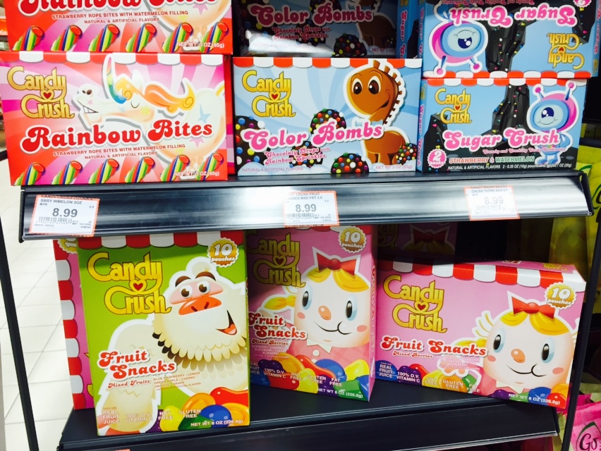
Was walking through the candy isle today, and did a double take on this corner shelf. It’s a Candy Crush branded shelf, packed with a variety of candy products straight from the game!
It appears that King’s merchandising team did a fairly good job in the overall look & feel of the packaging. It’s instantly recognizable, includes characters, objects, fonts and art styles from the game.
I must say, that the Candy Crush artwork in itself, when placed adjacent to other candy brands, blew the competition away. Here’s the standard candy isle that we can find in any supermarket around the world:
Not that appealing! A bunch of boring fonts, boring candy graphics, and boring wrappers! King did a great job seperating themselves from the ordinary.
Price point? Quite competitive with other brands.
Strategic location? Check, They occupied the corner shelf, which enhanced visibility to shoppers.
Health benefits? Candy doesn’t have any. King is well aware of this, hence they tried to promote a little bit of health in their products. The label reads:
- Real fruit juices
- 100% Vitamin C
- Nut free
- Gluten free
In a way, people feel a bit better buying somewhat ‘healthier’ candy. I’ll be sure to grab one next time.
Supermarket Real World Merchandise Licensing